Last time I posted a picture of the big, full-page woodcut facing the first page of Genesis from the 1527 Latin Bible. There is another full-page woodcut in the Bible, facing the first page of the New Testament. But there are also lots of small woodcuts that appear at the heads of books and initial woodcuts that appear (sometimes) at the start of chapters.
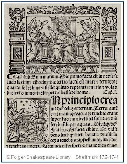
Here is an example of both of those. The one on top–God with kneeling angels on either side–appears at the top of the page, on the left-hand column of text, just before the summary of the chapter. Below it is a smaller, square woodcut illustrating another moment of God’s creation of the world. (According to Baudrier’s Bibliographie Lyonnaise, these woodcuts were not designed by the master who did the full-page one, but by G. Leroy.)
I mentioned last time that woodcuts were investments that were often reused in the same or in different books. One way that the use of woodcuts was spread out was to have reusable borders that could decorate a woodcut. Look closely at the woodcut of God and the angels. There is the central picture itself, surrounded by a decorative border along the top, a different decorative border along the bottom, and two columns–one on the left and one on the right–depicting little putti standing on plinths. Now look even closer. See the white space between each border? And between the border and the picture? Each of those elements are separate physical pieces. That illustration is made up of five woodcuts. Swap out the central picture, swap in a different scene, and you have the makings for a different book illustration. Need a longer border? Add in more border sections, and you can get a bigger frame for the picture. Pretty resourceful.
Woodcuts were the most common type of illustration in the early years of making books. An image was drawn onto a block of wood, the white areas of the picture were cut away, leaving behind the raised lines that would then be inked, and transferred to the paper as black lines. Because woodcuts could be set along the type in a printing press, and inked and pulled along with the type, they were a preferred type of illustration during the early years of printing. Later, engravings became more in demand, as they could convey finer lines and more detailed illustrations; on the downside, they were much harder to incorporate into books, as they required a separate printing process and often had to be sent to a different printing house. (The image of the bookworm from earlier this month is an example of a copperplate engraving.) The Metropolitan Museum of Art has an essay about woodcuts and some nice examples online, including the woodcut used to print Albrecht Durer’s Samson Reading the Lion.
Stay tuned for some examples of modern woodcuts in a beautifully made twentieth-century edition of Hamlet . . .
