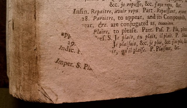
One of my favorite categories of early modern books are those that show errors, small mistakes made in the process of printing them.

I don’t love them because I like to laugh at them. I love finding them because they remind me that books are made by people and they carry with them traces of their making. Books don’t just magically appear.
The image above is of a leaf from The compleat French-master and it’s not too hard to figure out that it must have been folded as it went through the press (click on the photo to go to another post I wrote about this). I don’t know that there’s anything particularly informative about this mistake, but I do like it. Other mistakes tell us something a bit more about the printing process. Look through this slide show of a gathering from The Perfect path-way to salvation to see if you can spot what the error here is (if the slide show doesn’t work for you, you can see the images here):
It’s easiest to spot if you notice that the text here is going through the ten commandments in order and explicating each one: 1, 2, 3, 4, 5, 6, 8, 7, 9, 10 (I didn’t include the tenth, but trust me, it’s there on the next page). Now do you see the problem? Two pages have been switched: N7r and N8v are in each other’s slots. If you look at the images of those openings below, you’ll see that the catchword on the left-hand page of the top opening (“raine”) should be followed by the left-hand page on the bottom opening, which starts with the phrase “raine on the iust,” and the catchword on the bottom of the right-hand page of the top opening (“Why”) matches the beginning of the right-hand page on the bottom opening.


If you look at this figure from Philip Gaskell’s A New Introduction to Bibliography, which shows a common imposition for a 16mo (the format of this book), you’ll see that pages 13 and 16 (the page equivalents of signatures 7r and 8v) are right next to each other—easy enough for a perhaps tired pressman to reverse without noticing. (None of this format stuff making sense? I wrote a super short post elsewhere giving a quick demonstration with a newsbook. And you can check out our very own Impos[i]tor to try generating your own impositions!)

So, what do you think happened here, in this 1585 Vita di Giesu Christo?

On the one hand, it’s pretty obvious: the text at the bottom of the page is upside down. Oops. But wouldn’t you think that whoever was setting the type would notice it was upside down? That’s a pretty big mistake.
But if you look closer, the mistake isn’t that the type is upside down, but that it’s been inked. The text in italics is an oratione, as a reader has indicated in the marginalia, but unlike the one at the top of the page and elsewhere in the book, it’s missing its header. And the text below it starts in the middle of a sentence, rather than at the beginning. These signs, along with it being upside down, suggests that the text wasn’t intended to be read, but was serving some other purpose. What that purpose might be is clearer once we notice that the larger italics in the middle of the page announcing the end of the first section of this work: “Il fine della prima parte della vita di Giesu Christo.” The next part begins on the recto of the next leaf:

In other words, it doesn’t seem as if there was any text intended to be printed below the conclusion of the first part. A printer, however, can’t simply leave that space empty, nor can it be filled with flat blanks, since that means there wouldn’t be an even surface for the platen to push against, and the uneven pressure on the type could cause breakage. A printer in this situation would use bearing type—uninked type that might leave a blind impression on the page but otherwise service to balance out the load of the press. ((Check out the recent scholarship by Randall McLeod for more on the things that bearing type can tell us.))
I’m less sure about what is happening in the title page to this 1641 petition:

If you look carefully at this title page, you’ll see that there are some shadowy, misaligned markings as well as the properly printed main text. It’s especially visible in LONDONS with the DONS echoed just above and to the right. You can see an echo of “ble the K” in the same relationship to “Honourable the Knights” a few lines below that. My first guess would be that the paper slipped while being printed, or that perhaps the pressman brought down a fresh sheet on to the type before the type had been reinked for a new impression. But there’s clearly some sort of pivoting that’s happened—the right half of the page has the extra impressions, but the left half is clean. And if you look closely at the white space around “Names” I wonder if there isn’t yet something else to notice:

Here you can see that the most of the faintly inked material is in a parallel plane, above and to the right of the proper text. But in the last line above, there’s an “N” above and to the left of “Names” in addition to the one above and to the right. That same pattern is also visible in the “IAN” of “PARLIAMENT.” So what caused this to happen? I’d welcome any thoughts in the comments below!