Last year, at the start of each semester, I gave you something from a school book to celebrate the return of classes: in the fall it was Lily’s Latin grammar; in the spring, Comenius’s picture book. This semester, I think I’ll give you something slightly different to celebrate the return of students: a look at some of the books my students worked with last spring.
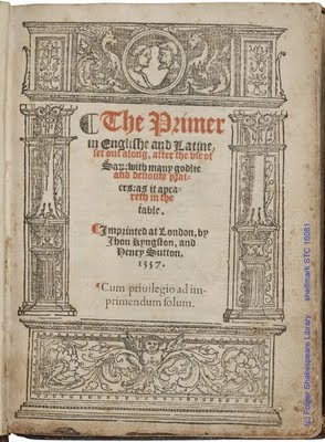
First up, this 1557 English book of hours:

The student who was working on this book was a theology major and chose it, I think, to have a chance to think about Catholic liturgy and print. There’s a lot to be learned about liturgy in studying it. The title of the book signals some of the basic issues at play: The primer in Englishe and Latine, set out along, after the use of Sa[rum]: with many godlie and devoute praiers: as it apeareth in the table. A brief history of primers in encapsulated in that title. There’s the reference to “Sarum use”, specifying this book of hours as following the Salisbury rite, the form that dominated England Catholic liturgy. Most notable is the identification that this includes a translation of the Latin prayers into English, an increasingly popular approach to the prayers after the Reformation, and one that was strictly regulated. That this is in both Latin and English links it to a specific historical moment. It wasn’t until after Henry VIII’s split with the Catholic Church that books of hours in English (usually referred to as “primers”) began to be published in England–and Henry, after 1545, promulgated his Royal Primer. With Mary’s reign, the Sarum rite again became the sanctioned form of the primer, though the popularity of English translations continued. The imprint of this book hints at the Sarum primer’s popularity: “Imprinted at London, by Jhon Kyngston, and Henry Sutton. 1557. Cum privilegio ad imprimendum solum.” You could assume correctly from the “cum privilegio” that printing primers was a lucrative business that was awarded to a specific printer. You could correctly assume, too, that we would see a rise of English Sarum primers printed during Mary’s reign.
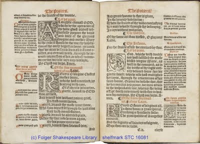
That’s a brief outline of some of what we can learn from the title page–a sort of cultural/political/religious history that can be gathered from studying this book. But we can do something fun, too, with the mise-en-page of this book:

This opening is mostly fairly typical: there’s the English translation in the large columns closest to the gutter in a nice blackletter font, and the Latin text in the outer columns in a smaller font. The decorated initials are printed woodcuts (that is, not hand-rubricated or illuminated). And the running titles and other directive texts are printed in red ink to guide the reader. All of these details can lead you into a study of how this book was designed to be used.
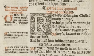
But there’s something else we can learn from this book, too. Here’s a close-up showing the text in more detail, including my favorite moment:

Did you notice it? Take a look again.
What is the title given to this prayer, which begins “Rejoyce O virgine Christes mother deare”? Is it “Of the five corporall joyes of our Ladie.”? But why is “Ladie” printed in black? Look underneath–it was first printed “of our lorde.” Ooops. Well, anyone can make a mistake, right? At least they corrected it. And that’s what I love about this page. Here’s the thing–printers did not typically print red and black ink at the same time. Think about it–it would be pretty hard to dab black ink only on the black bits and red ink on the red bits. You wouldn’t be able to do it with your standard ink balls.
Instead, you’d follow a much more complicated series of steps. First, you’d set the type for the whole form (that is, not just one single page, but all the pages on that side of the sheet). Then you’d determine which words were to be printed in red, take those letters out and replace them with blanks. You’d ink the whole thing with black, using those ink balls that have been keeping nice and moist by soaking in urine, and run it through the press once with black ink. After you’d run through the entire run’s worth of copies of that form, it would be time to do the red ink. You’d cut a new frisket (the protective sheet that covers over what you don’t want to get inked) that would have holes for the red text but keep the black text covered. You’d replace the blanks with the red text, which has been raised slightly above the black text so that when you pull the press, only the raised type will print. And then you would run the entire set of sheets through the press again. If you’ve done it all right, the red text will print in the holes that were left behind after the black ink run. As you can see from this book, sometimes the red and black ink printed a bit more askew. (You can find a tidier example of two-color printing at this earlier blog post.)
So here’s where I really love this: the printers, after making this mistake, recognize it, and want, understandably, to fix it–which means running the entire thing through the press for a third time! Oh, the labor of it all!
That’s what I’m going to think of at the start of the fall: sometimes learning and teaching doesn’t happen on the first try, or even the second. But that’s no reason to stop working! This is also a good reminder of how much of what we do is serendipitous–looking up this book in the catalogue, there was no sign of this cool printing tidbit. It was only because Caitlin looked through every single page in this book with her eyes wide open that she found it. What a nice reward for her curiosity! And that feels like another excellent piece of advice for all of us: don’t forget to be curious along the way and to be open to discovering something new.
Happy learning!
(Want to read about printing with red ink in more detail? Joseph Moxon’s Mechanick Exercises, as always, is your not-to-be-beat source about early printing; for the section on two-color printing, see pages 328-30. This lovely primer can be found in our catalogue here; a set of zoomable images from it are here.)
>Excellent! I've learned a new term (and a lovely one – "frisket") AND had the happy thrill of recognizing one of my favorite books (blame Eamon Duffy) in a blog post. A great inspiration for the new term, indeed.
>Nice lesson, Sarah, though not always an easy one to take to heart.
>Lovely! With only a couple of weeks left before the semester starts, I'm definitely in the mood for both inspiration and a little learning, and I got both here. Thanks!
>Couldn't the correction have been made by hand (with the sorts held together in some makeshift contraption) rather than by a third pass through the press?
>Ryan,I wondered about that, too, but I'm not sure it would have saved much effort. It would depend, of course, on whether it's just a few sheets with this error or nearly the entire run. For a large number of sheets, I'm not convinced the effort to do it by hand would have been less work rather than more. After all, once you've got a new frisket cut, and the "Ladie" substituted for "lorde", running through 100 sheets is not much more effort than running through 10. But doing it by hand would require making a contraption to hold the sorts, lining it up for each sheet, and generating enough force for the paper to take the ink solidly. At what point does doing it by hand become more or less efficient that running it through the press?