It’s been much longer since I’ve written a proper post here than I meant for it to be. In my defense, I’ve been pretty busy over at The Collation, running the show and writing my own contributions. There’s lots of good stuff over there, including a whole world of manuscript exploration that I don’t do here; check out Heather Wolfe’s and Nadia Seiler’s interesting posts if you like that sort of thing (and if you don’t think you do, browse anyway and you’ll learn that you do!). And if you’re looking for advice on using Folger digital resources, like searching Luna and the power of permanent URLs and Mike Poston’s new tool, Impos[i]tor, the tooltips series is for you.
In any case, this post isn’t meant to be an advertisement, but to do a pretty picture penance: sharing some great book images, even if I don’t have the time to talk in any detail about them. ((Ok, so this isn’t really penance, given how much fun it is for me to do this, but I couldn’t resist the alliteration.)) So . . .
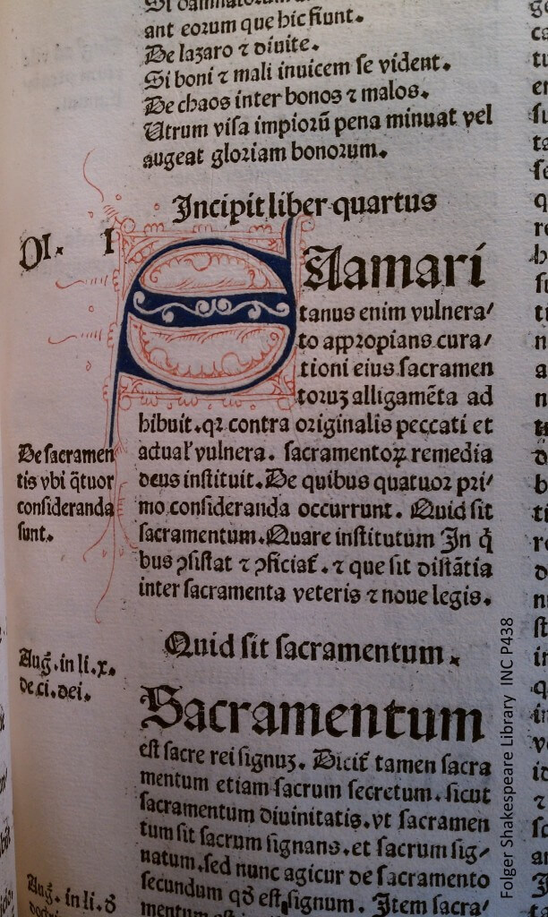
Voila! This is a lovely blue and red penwork initial letter from an edition of Peter Lombard’s Sententiarum libri IV, printed in Basel in 1482. (Here’s your catalog record; all photos, through cell-phone crapola, can be clicked and embiggened.)
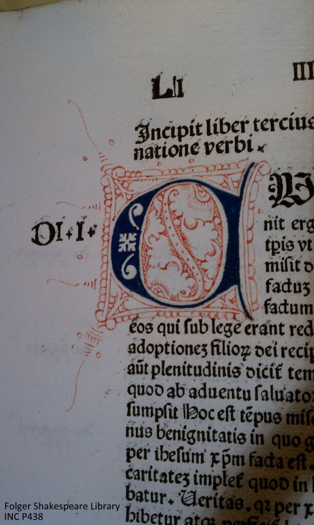
Here’s another initial, where you can see how delicate the penwork is. I love how the details drape down the column of text:
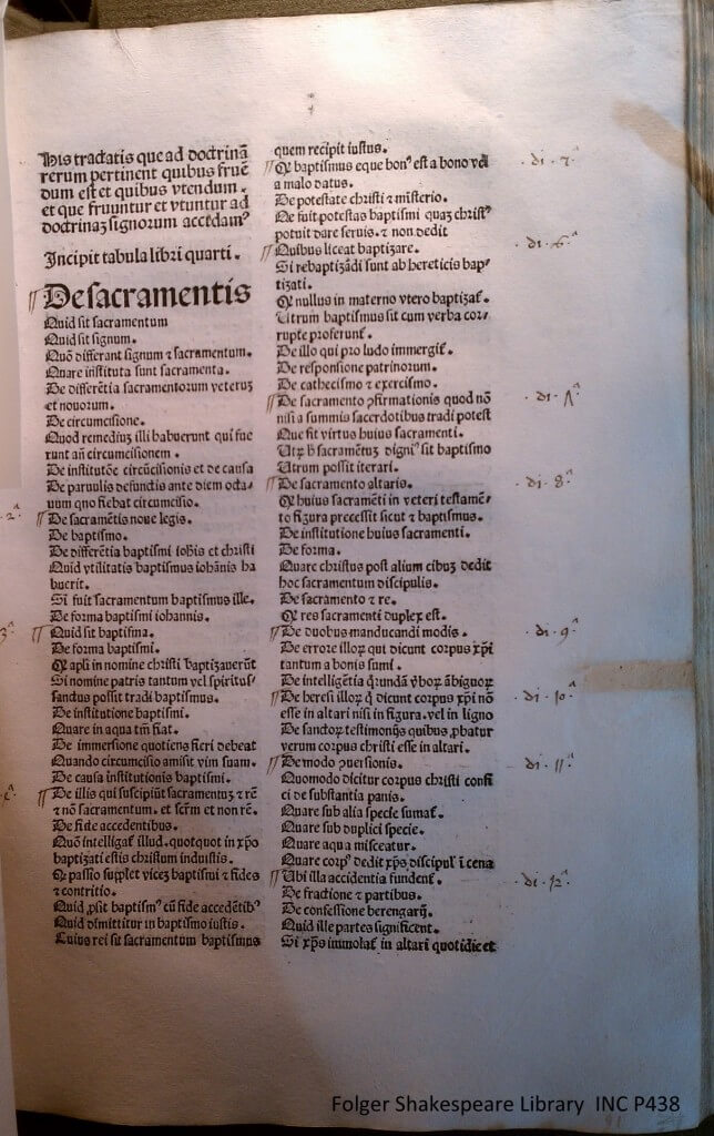
 Not all the initials in the text are so fancy. Here’s a nice, albeit plain, red one:
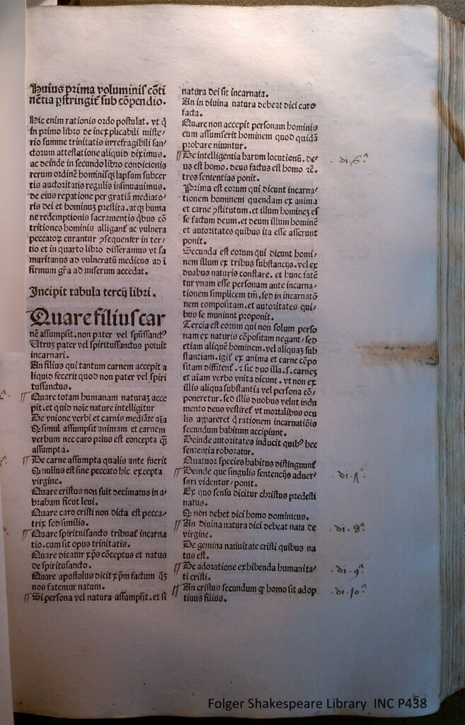
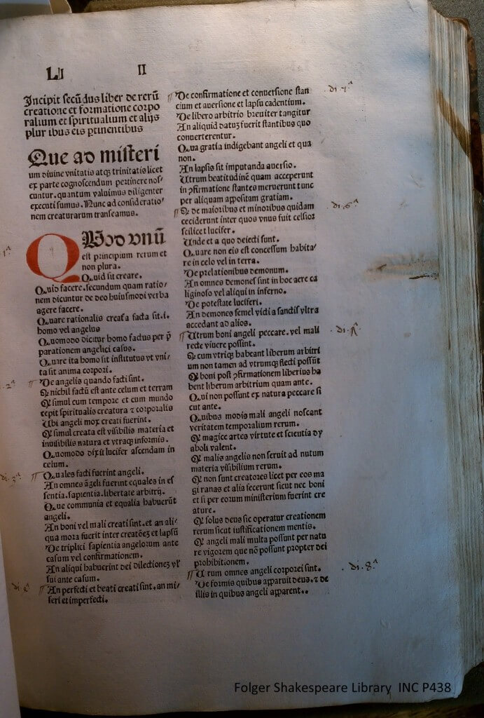 But that’s not the most interesting detail in this photo. Look again. And then look at this one:
And this one:
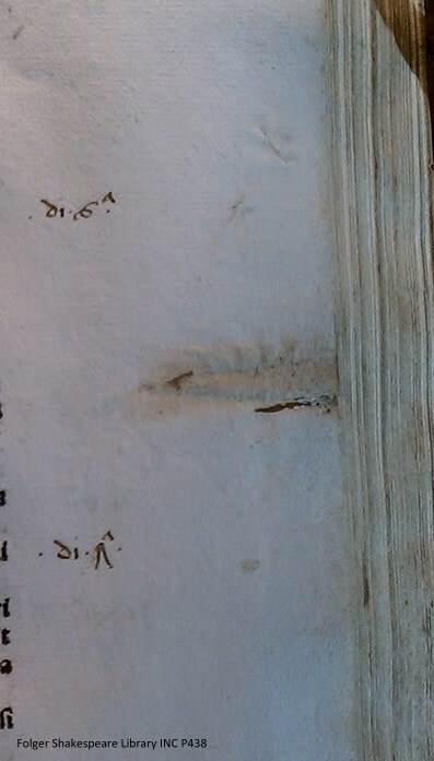
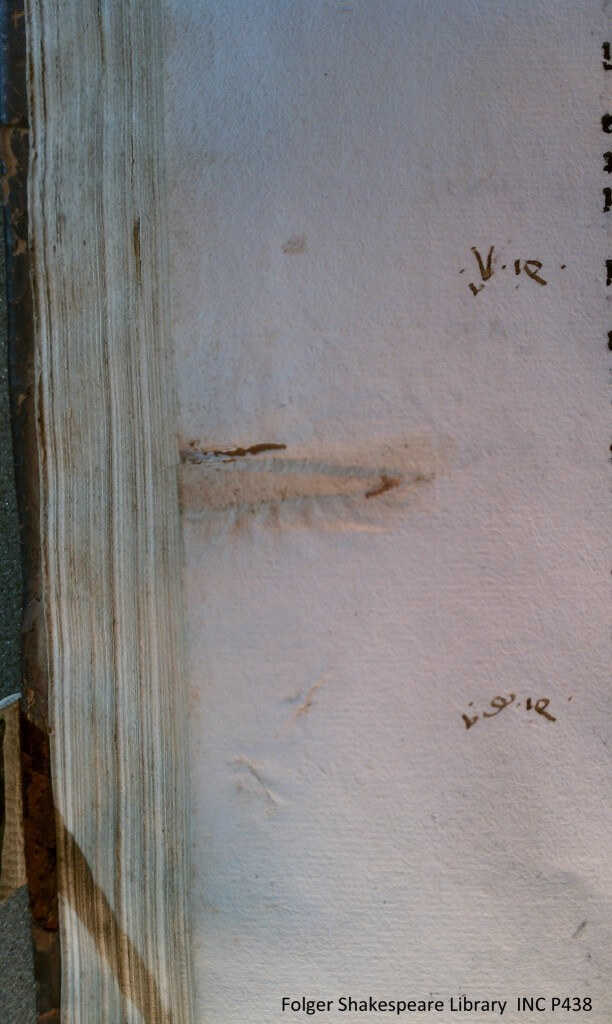
You know what I’m talking about, right? They’re the impressions left behind by the finding tabs that were once there! If you look again at the three photos, you can see how they line up, each new section marked slightly below the previous one, so that the tabs stick out, all easy to find and to use to jump to the beginning of a section. Here’s a detail from the first tab:
And here’s the verso of that leaf:
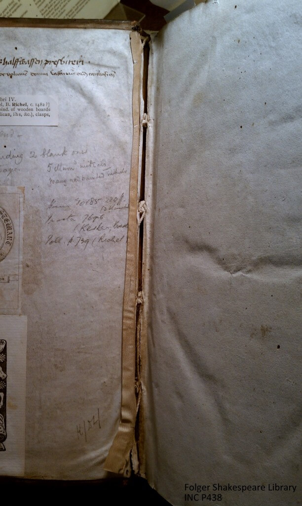
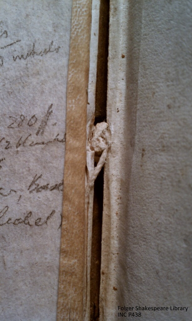
You all know how I like it when I see details of physical features of books that are normally hidden:
Because the front board is loose, you can see some of the knots of the sewing structure holding the binding and the book together.
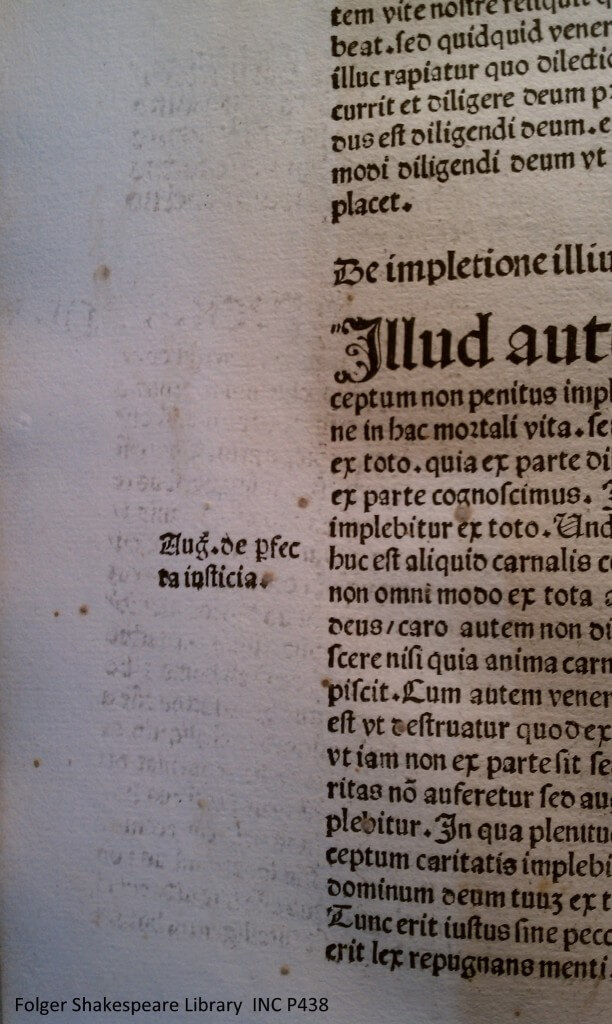
And what else do I love? Details that show something about the printing process:
At first glance, that looks simply like ink bleeding through from the other side of the leaf. But did you notice any bleedthrough on any of the other pages? That’s some heavy-duty paper. No, that isn’t bleedthrough, it’s offset! In the words of John Carter, offset is
The accidental transfer of ink from a printed page or illustration to an adjacent page. This may be caused either from the sheets having been folded, or the book bound, before the ink was properly dry, or from the book being subsequently exposed to damp. Offset from engraved or other plates on to text, and from text on to plates, is commoner, and also much more disfiguring, than offset from text on to text. Text offset occasionally provides valuable bibliographical evidence, since it usually derives from the very earliest stage in the assembly of the printed sheets into a book. And some of the neatest deductions have been made from the offset, not from one page to another of an individual copy, but from the offset on a page of one book from printed sheets belonging to another which happened to be stacked with it at the printer’s.
So there you go, a whole bunch of my favorite things, all in one book!
I love what people do with the text of the *Sentences*. Of course, many marvelous things are done (in manuscript and print) with lots of books, but I swear, Lombard is a magnet for the OCD and otherwise imaginative text manipulators. If I was an art historian, I would get to work on that.