On my last post about woodcuts, I promised some beautiful twentieth-century ones, so here you are:
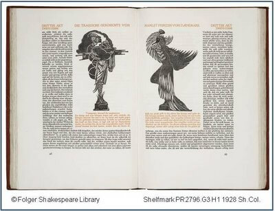
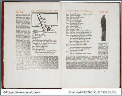
This is the opening to a German book arts press edition of Hamlet, printed in 1928 by Count Harry Kessler’s Cranach Press in Weimar. The book consists of Gerhart Hauptman’s translation of the second quarto of Shakespeare’s play, surrounded by the relevant source texts of Saxo Grammaticus and Francois de Belleforest. Throughout the book are beautiful woodcuts done specifically for this edition by Edward Gordon Craig. (A second version of this book, with the play in English, was printed in 1930.)
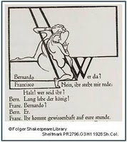
The Cranach Press Hamlet does a remarkable job of using the woodcuts not simply to illustrate but to interact with the text and to perform its meanings through shaping the look of page. Notice how the nervous guards huddle against the majuscule “W” in the opening scene, while the form of the Ghost lurks on the far right of the text. Or examine how the dumbshow preceding Hamlet’s play is set off from the text just as the performance language of the dumbshow sets off the play-within-the-play and the performance of Hamlet itself. Here, the beautiful and mysterious players stand on top of the red text of the dumbshow–the only use of red ink in the playtext.

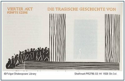
The most striking moment in the book, however, comes at Ophelia’s death.
The crowd of spectators (those watchers who are omnipresent in the play) push against the solid walls that hold within them a rectangle of blue ink. Just barely visible in that blue is the white outline of Ophelia, walking away from the crowd.
It’s a devastating scene that hits home because of its skillful mise-en-page.
In many ways, the Cranach Press Hamlet pays tribute to the power and beauty of early printed books. The typefont was designed by Edward Johnston after the fonts used by the German printers Fust and Schaeffer. And the layout of text surrounded by commentary mirrors that of early printings of classical and religious works. The use of woodcuts, too, is part of the reforming of early printed typography. And they are a powerful reminder of how much the layout of the printed page can effect our response to the work.


