I’m excited to have contributed a post to HiLobrow’s Kern Your Enthusiasm series, which has a lot of smart, interesting people writing about a favorite (or not-favorite) font. For my bit, I wrote about the typefaces that Edward Johnston designed for the Cranach Press Hamlet, published in 1928.
My opening gives you my take on the font:
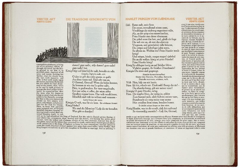
If you wanted to model a book after the earliest printed books, you might mirror their layout — placing the main text in the middle of the opening, with commentary surrounding it along the margins and illustrations interspersed. You might commission one of the great artists of your age to cut new woodcuts and choose a text that is itself centuries old but still loved today. And you might find a typeface to do the same, straddling the past and the present.
Go over to the post to read the rest (and check out the others in the series—they’re all linked from the introduction to the series and if you like old fonts, you’ll definitely want to look at Matthew Battles on Aldine’s italic).
And then if you want to take a closer look at Johnston’s typeface and the early Schoeffer that influenced him, the following links will bring you to high-resolution digitizations:
- three page openings of the Cranach Press Hamlet (Folger Shakespeare Library)
- a cover-to-cover 1457 Psalter (Österreichische Nationalbibliothek)
- a cover-to-cover 1462 Bible (Bayerische Staatsbibliothek)
- a cover-to-cover 1472 Decretum (BSB)