Over at The Collation last week, I wrote a blog post providing a quick explanation for what might be gained from looking at multiple copies of digital facsimiles of the First Folio and linking to the eight copies I’ve found. Mostly what I was interested in there was the availability of such things and a taste of the joys of copy-specific reading. Here I want to look at what actually matters to me a bit more: the usability of such resources. It should be perfectly clear, but I’m going to say it anyway, just to be safe. This is my personal site and I am not representing the Folger’s point of view here, only my own as a user of such resources.
Before I look at specific examples, here’s what I want as a scholar:
- high-resolution cover-to-cover images, zoomable to, say, larger-than-life size with full clarity so that I can pick out details on pieces of type;
- choice between viewing as pages and viewing as a book with two-page spreads that, ideally, convey the depth of the book and the shifting balance of pages as you move through it so that I know where in the volume I am;
- navigation synced to plays (with modern acts and scene divisions), to signature marks, and to page numbers so that I can easily find my way to wherever I want;
- cataloging information that tells me something about the copy I’m looking at; at a minimum, shelfmark and identification of which pages are not original F1 leaves, but preferably including information about provenance, binding, marginalia, uncorrected pages, and other copy-specific details;
- cataloging information that tells me something about the digital surrogate I’m looking at; at a minimum, when it was built and who built it;
- a CC-NC or, even better, a CC-BY license that will allow for downloading and reusing at a minimum specific images and, preferably, the entire work, so that I can share it in my teaching and scholarship and so that I can compare multiple copies;
- and since I’m dreaming here, the ability to read offline in a friendly interface so that I can access it even when I’m (gasp!) without a good internet connection;
- and the ability to add my own annotations, so that I can keep track of what I’m finding.
Well. That’s not asking for much. Maybe someday all my desires will be met, but it certainly hasn’t happened yet. And it won’t happen unless we start advocating for what we need in these resources. (My focus here is on the First Folio, but my points hold for any digitized book and, to a slightly lesser degree, to any digitized textual work. We all need transparent records, digital copies that are available to reuse, and high-resolution images that convey not only the words on the item but the physical manifestation of that item.)
So in the spirit of helpful critique, here’s how the 8 copies currently available for free online stack up. (N.b. I’ve linked to catalog records where I can find them in the headlines. West numbers refer to the number given the copies in Anthony James West’s census of First Folios. ((Anthony James West, The Shakespeare First Folio: The History of the Book, 2 vols (Oxford UP, 2001).)) Full descriptions of all these copies can be found in West and Rasmussen’s Descriptive Catalogue; ((Eric Rasmussen and Anthony James West, eds, The Shakespeare First Folios: A Descriptive Catalogue (Palgrave 2012).)) quick takes on which copies have leaves missing or in uncorrected states can be found at the end of my Collation post.)
tl;dr I imagine many of you won’t read all the way through this 4,000-word post, so here’s the unsurprising upshot: digital projects don’t age well. For the First Folio, that means that what used to be cutting-edge in terms of quality and interface can, 5 to 10 years later, can be woefully behind the times in offering what users want. We need to plan ahead so that we can offer users the tools they want now while also building in reuse for future users. That means, above all, super high-quality images, open access, clear documentation, and constant exploration.
Folger Shakespeare Library, copy no. 68 (West 126)
Available as page spreads in the Folger’s digital image collection, as page spreads and as a pdf through the World Digital Library; downloadable as individual page openings and as a pdf.
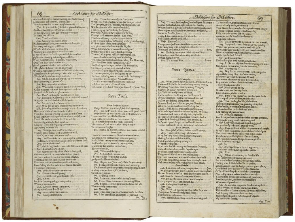
This tends to be my go-to copy of the First Folio when I need to check what’s in it and when I need to zoom in for good details. I like this copy in part because it’s a complete copy—all the leaves are original F1 leaves, rather than facsimiles or replacements from other copies or later editions—and it has some nice manuscript markings setting off some passages. (I always like reminders that books aren’t pristine collectibles but objects to be used.) I also like the Folger’s digitization of it. It’s cover-to-cover, so you can see the Wodehouse bookplate in the front, and the full-page spreads show the depth of the volume as well: in this image from Measure for Measure, you can easily spot from the visible page edges that we’re still well near the front of the volume.
I like, too, that the images are high-resolution enough that you can really zoom in and see details. Here is a screenshot of the most zoomed-in view of the same opening (click on the image to enlarge):
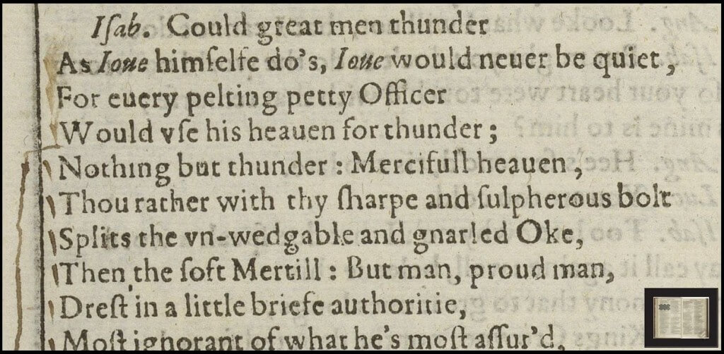
I also like that it’s easy to download individual images from the Folger’s Luna interface; the full-page spread that you see above is the maximum size that is allowed for downloading; click on it and you’ll see how big it is. And it’s easy to link to individual openings (see the examples that I’ve included above). If you’re a more adept Luna user (or if you’ve read Jim Kuhn’s tooltip posts in The Collation), you’ll find that you can link to zoomed-in views or to view of multiple images, too (see, for instance, this comparison of two copies). Information from the Folger’s incredibly thorough catalog records is included in Luna, so it’s easy to understand what you’re looking at without leaving the image; information is also provided identifying the image, including the signature marks (but not, however, page numbers or modern act/scene divisions). There isn’t any obvious information about when the images were taken or anything else about the dates or tools involved in the production of the digital images and interface. ((My experience of using the Folger’s Digital Image Collection that the record usually indicates when the image is a digitization of film and when a full-page spread is the result of stitching together two page images, so I would assume those are not relevant here.))
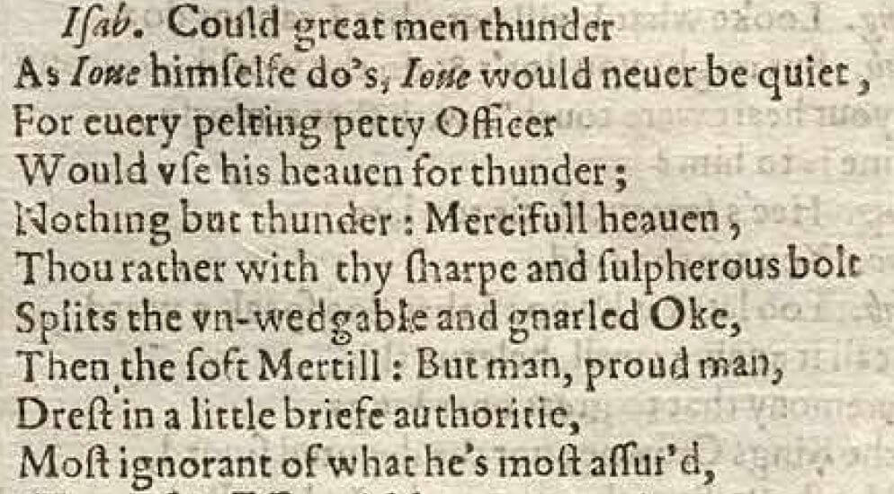
But what I don’t like about using this also comes from the Luna interface. It’s not particularly easy or intuitive to quickly find your way to specific places in the volume. If you’re looking for something in King Lear and you know your way through the First Folio already, your instinct will be to scroll through the thumbnails until you find the beginning of the play. But that gets annoying. When I was looking for a page that included some of the marginalia I mentioned, the easiest way to do it was to flip through the pdf I downloaded from the World Digital Library, find the opening that looked good, and then locate that in Luna by skimming the thumbnails. The pdf is not very high resolution in and of itself, so while it’s fine for full-page spreads, if you try to zoom in to see details, it blurs out pretty quickly. Here’s a rough equivalent to the zoomed-in view from the online version, this one from the pdf (it’s about 200%):

So I switch back and forth between the two when I’m trying to locate the details of something specific. It’s also worth mentioning, speaking of ease of use, that the pdf file has most of the page openings rotated 180°. The best option is to download it and then use a tool like PDF Toolkit to rotate all but the first and last two pages of the file.
If you’re looking for a specific play, it’s possible to construct a search to just pull up, say, Measure for Measure in copy 68. Use “Advance Search” to search “Call Number” for “STC 22273 Fo.1 no.68” and “Image Details” for “Measure for Measure”; when you get the results, sort them by “Multiple Page Sort Order” and *phew* you’ve got your play. There used to be links on the Folger’s website for early copies of the plays, including in F1 and relevant quartos, and my understanding is those should be restored soon (I’ll update this with the relevant link when that happens).
The World Digital Library’s interface is built around the same images that the Folger provides through Luna. It seems like it should be slightly easier to navigate (instead of going through thumbnails, you can click arrows to turn to the next or previous opening), but I find the transitions between the images to be so slow as to be more frustrating than helpful.
The Folger has licensed this, as with the rest of the items in its digital image collection, with a CC-NC license.
Folger Shakespeare Library, copy no. 5 (West 63)
Available as page spreads in the Folger’s Digital Image Collection, as a pdf from Octavo editions, and as page spreads through the Rare Book Room; downloadable as individual page openings and as a pdf.
This is my go-to pdf, though not my go-to online digital copy. It’s a good copy of the First Folio—only a few original leaves missing ((I’m pretty sure my notes from West have it as only missing one leaf, but the Folger’s catalog shows it as missing three))—and was one of the first really high-resolution digitizations of the First Folio that was easily available. Octavo chose it as the basis of their edition of the First Folio, published on CD-ROM in, I think, 2001. That edition, available for purchase but also freely through the Folger’s catalog record, is rich not only for the nice digitization of the First Folio, but for the incredible contextual material accompanying it, including essays by Arthur Freeman, Stephen Orgel, and A.R. Braunmuller, as well as a copy of Peter Blayney’s amazing booklet on the First Folio. It’s a wealth of information. (The pdf file at the Folger has been corrupted; at the moment it has the contextual material, but not F1 or Blayney. I think it will be replaced with a better file soon; I’ll update this when that happens.) If I had to recommend one digital First Folio to an interested non-specialist, the Octavo pdf is what I’d choose, given the strengths of its digitization, its ease of navigation, and its fabulous contextual material.
The pdf is easy to navigate—you can use the arrows to move back and forth, of course, but each play and act/scene is bookmarked so that you can jump straight to it. And the resolution is ok, maybe slightly better than the WDL pdf of copy 68:
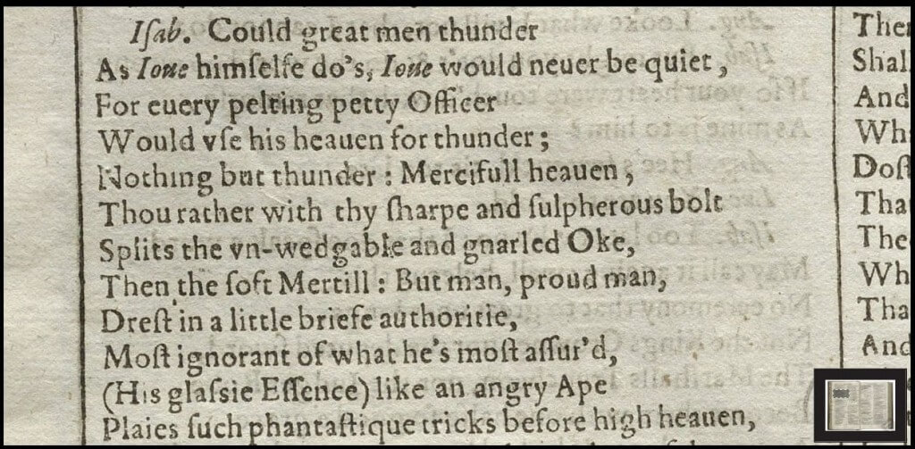
The digital copy in Luna has the same interface advantages (cover-to-cover! full-page openings showing depth!) and disadvantages (argh, navigation!) of copy 68, but you can’t zoom in to quite the same level of detail in copy 5:
The images through the Rare Book Room are the same as in Luna, but with a different interface. I like the ability to use arrows to navigate through the book, but it doesn’t let you zoom in very much.
Bodleian Library, University of Oxford, Arch. G c.7 (West 31)
Available online in page spreads, downloadable as individual page images, and eventually as a pdf (I’m positive I saw something about this latter point somewhere, but now I’m not finding my steps back to it; I hope it’s actually true and not something I totally hallucinated).
This is the most recent addition to the collection of digitized First Folios; you can learn more about the publicly funded campaign to digitize it on the project’s blog, “Sprint for Shakespeare.” It’s also a (kind of) infamous copy of the First Folio. The Bodleain acquired it in 1624 and then—gasp!—subsequently got rid of it, apparently in 1664 when the Third Folio (which it purchased) made the First “obsolete.” The Bodleian’s copy of the First reappeared at the University in 1905, when Gladwyn Turbutt (an Oxford undergraduate whose family owned the book since the early eighteenth century) brought it in for advice about the binding. It was immediately recognized as the long-gone Bodleian deposit copy and the Turbutt family delayed its sale to the highest bidder (*cough cough Henry Folger*) to give the Bodleian a chance to raise the money to purchase it, which it did. What makes this copy interesting is not only the Bod’s foolishly getting rid of it and its spectacular return, but the fact that the book remained in its original binding and showing all the wear-and-tear of its usage.
The online interface of this copy’s digitization comes in two options. The first is through the BookReader interface developed by the Internet Archive. It lets you navigate the book either through thumbnail images or in one-page or two-page spreads. There are bookmarks to let you easily jump to specific acts and scenes in specific plays, and in the two-page opening view, you can easily see a visualization of page edges to show where you are in the volume and to flip ahead to specific pages:
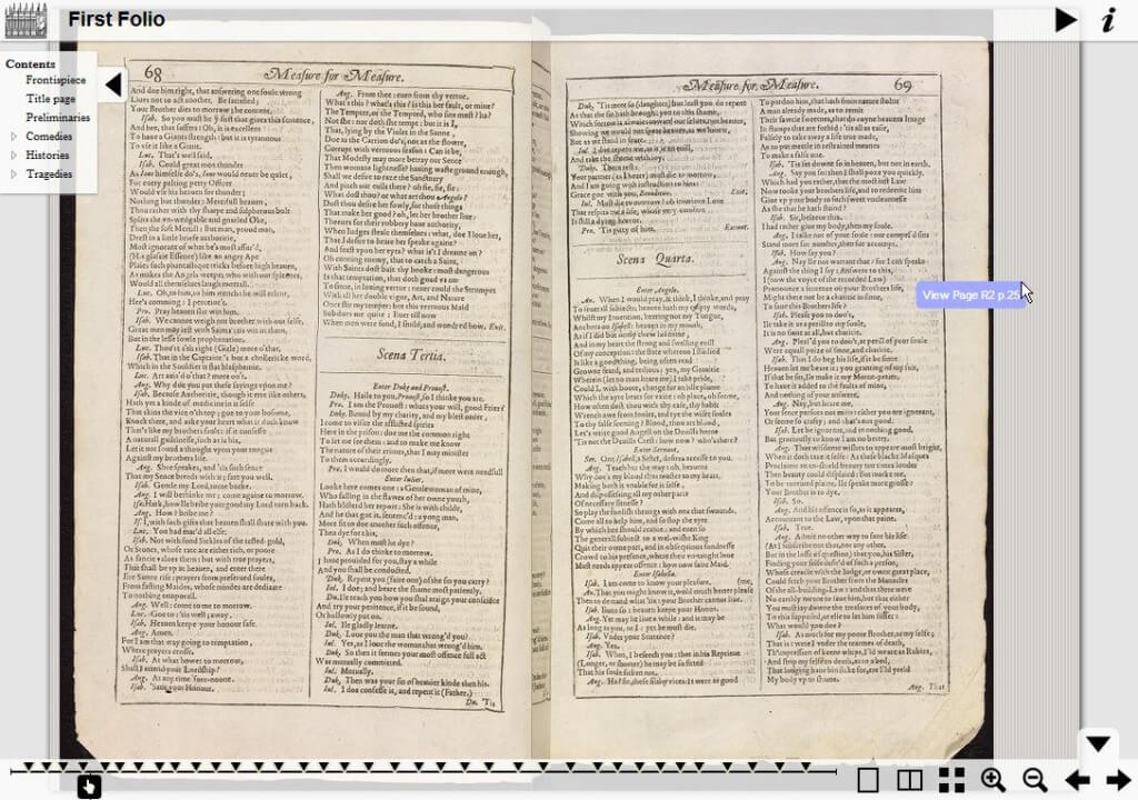
I generally find this a good way to navigate a book—it’s easy to work out where you are and to get to where you want to be. The fake visualization of the fake edges is a little weird, though, and while I love the pop-up that shows you where your mouse is when it’s jumping ahead, I couldn’t actually get the book to jump when I clicked on the margins. And in this particular incarnation, however, I’m disturbed by the gutter issues. Since many of the images of individual pages includes a glimpse across the gutter of the opposite page (not a bad thing for an individual image), when they’re stitched together into a page opening, the weirdness across the gutter is, well, weird.
On the other hand, working with the individual page images is super easy. There’s a link that takes you to pages of thumbnails, each of which is identified both by signature mark and by play title and page number; the image below, for example, is labeled “F4v / MM p.68.”
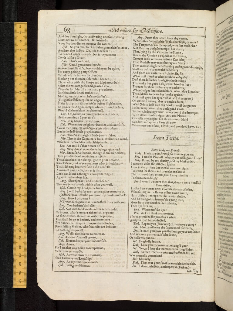
It’s a good resolution (click on the image above to be able to enlarge it to its full size), and I like the touch of including the ruler to indicate the leaf’s size. It’s also wonderful that the Bodleian has released this under a CC-BY license and clearly indicates what that means in terms of usage. They have a great statement on the site’s accessibility, too (it looks like that’s something required by Oxford; I wish more places would keep accessibility in mind as they are designing their sites). I wish the site was more clearly linked to the cataloging information (I got to the catalog record by navigating through the link to the Bodleian’s main website in the upper right corner of the site and the searching in the catalog for the shelfmark). And I haven’t figured out an obvious way to be able to link to specific openings in the book view, although you can link to individual page images (check out the front pastedown, for instance!).
The Bodleian’s biggest strength is combining ease of use for non-scholars and for scholars. By using the Internet Archive interface, they’ve made it friendly for general browsers to look through the book. (As Pip Willcox said in a tweet to me, given that the public funded the project, the Library felt strongly that it had to be fully open-access—and, obviously, that it had to be friendly to use.) And by separating the book into individual page images, they’ve made it usable for scholars like me. That, I think, is key to successful digital First Folios—they need to work not only for the finicky experts but for the general user. And I think the Bodleian has mostly achieved that, unlike most of the other digital copies.
Meisei University (West 201)
Available online as individual page images with transcriptions of marginalia; downloadable as individual page images. Akihiro Yamada’s book on the marginalia and his transcriptions is available in its entirety as well.
This is a fascinating copy of the First Folio, and the most interesting copy of the ones that have been put online. It has extensive early modern marginalia dating, according to Akihiro Yamada’s study of it, from the 1620s or 1630s in a Scottish hand. There are underlinings, dots, and marginal notes focusing primarily on summarizing the play. The annotations are understandably the focus of this interface; it’s really not designed to read the play easily, but does offer a range of ways into the marginalia. You can navigate to individual pages by choosing the play and either act/scene/lines or through-line numbers; you can also navigate by signature marks or by image number. Once you’re at a page, you can then use the arrows to browse to the next or the previous image. It’s not instantly obvious—the landing page is a black screen instructing you to “Please Search Page Image” rather than the first leaf of the volume. But once you’re on an image, you have the option of enlarging the page (the initial result is thumbnail sized), enlarging the marginal notes, and reading a transcription of the note.
Here, for example, is a screenshot of a page from Measure for Measure, enlarged to its largest side, along with a detail of the marginalia and its transcription:
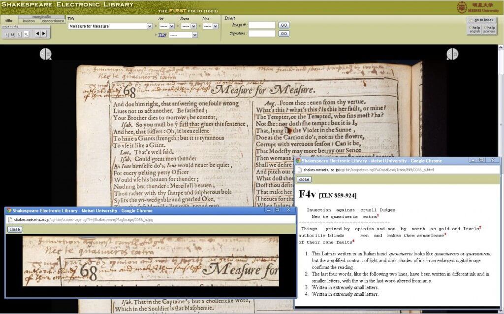
As you can tell, the page itself doesn’t enlarge particularly well, though the details of the marginal notes are a bit better. You can also download a page image:
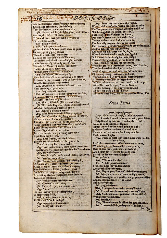
It’s pretty small, but its resolution is okay (as elsewhere, click to enlarge to its full size). Their copyright page states that “All rights reserved; no part of this database may be reproduced or reprinted in any form, except for non-profit-making, educational or scholarly use. In such cases, please cite the copyright of Meisei University and write to the contact address.”
As I said, though, the point of this digitization isn’t to read the First Folio, it’s to study its marginalia. So while you can search by page image, you can also search the marginalia, using either the “lexicon” option (words that appear in Yamada’s index) or the “concordance” option (words from the entire marginalia corpus):
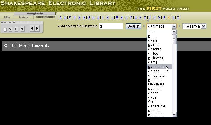
I don’t really have a project that would use this, but I like that they’ve enabled it. The (comparatively) low resolution and the sometimes not-intuitive interface are likely residues of the project’s age: it began in 2002 and ended in 2008. Quibbles about that aside, it’s wonderful that Meisei, which bought the book in 1980, has taken these steps to make its riches explorable.
Since I’ve already gone on long enough, and am feeling a bit burnt out, my examinations of the remaining online First Folios is going to be speedier.
University of Pennsylvania, Furness Library (West 180):
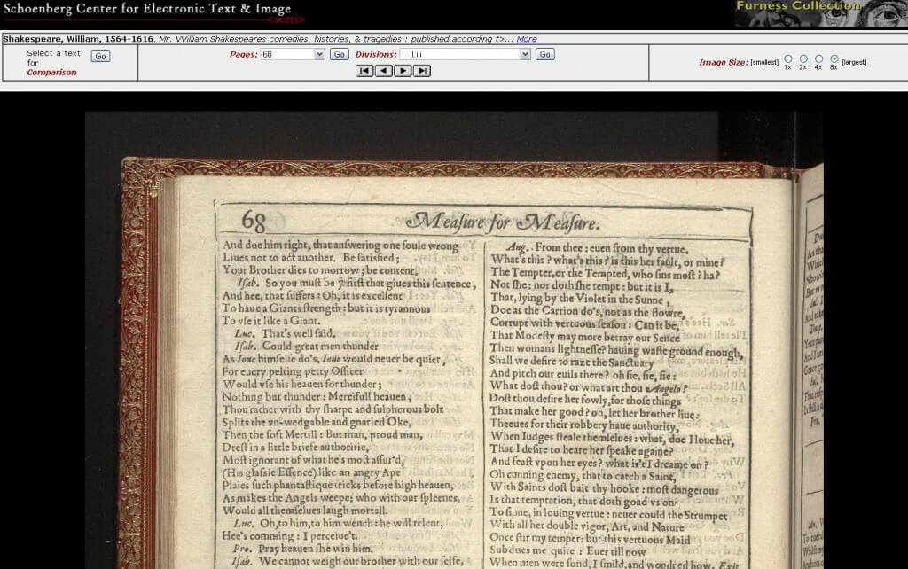
Available as individual page images and possible to save as jpegs. Penn’s interface makes it easy to navigate the First Folio by play or by page number. It’s also possible to compare F1 to other works if you follow the “select a text for comparison” option in the upper left—if you’re interested in Hamlet, there’s a lot of goodies in there, and it’s nicely displayed side-by-side. Information about the specifics of the copy or of the image aren’t obvious. (I happen to know that this interface was put together in the mid-1990s, since I had grad school friends who worked on it.) The book begins not with its cover (although you can catch glimpses of it and page edges here) but with the blank recto of Ben Jonson’s poem, “To the reader” (sig. ΠA1r). (Penn also has a copy of the Peter Blayney booklet I mentioned above, which is handy to know if it’s not available through the Octavo pdf.)
Brandeis (West 153) and New South Wales (West 192)
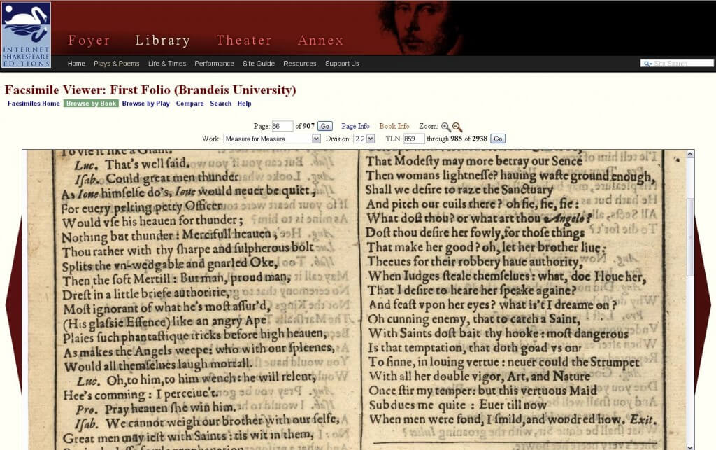
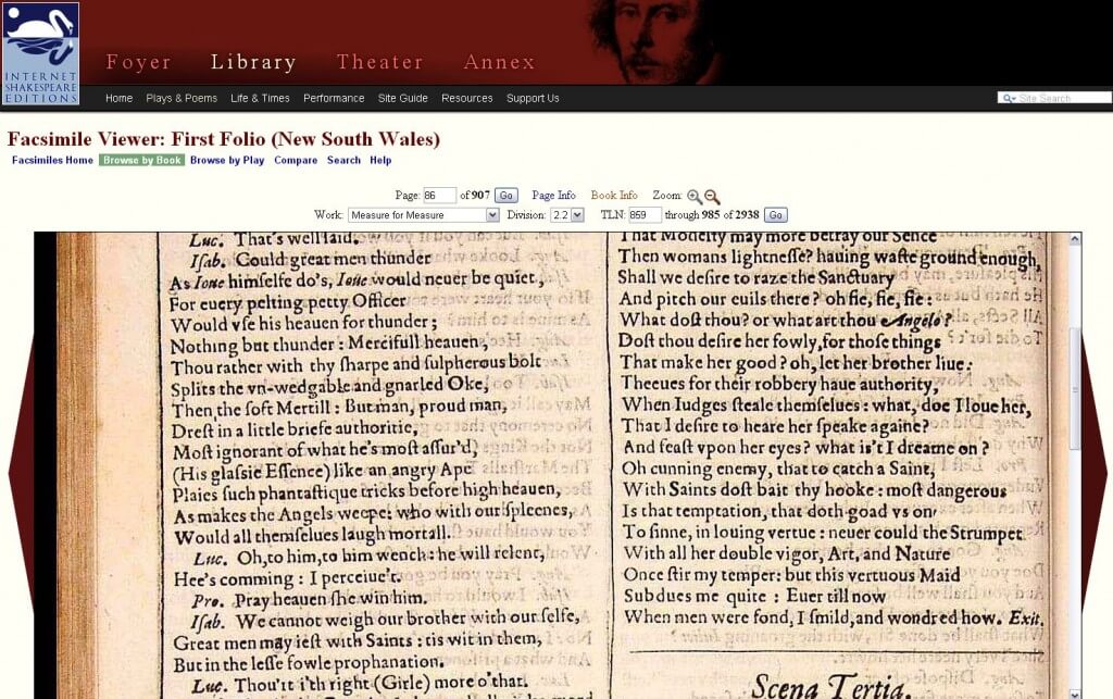
I’ve grouped these together because they are both available at Internet Shakespeare Editions as individual page images than can be saved as jpegs. The Brandeis copy is also available through Perseus, though I find that interface doesn’t have much to recommend it over the ISE. Neither one of these is a great facsimile (the NSW is oddly pink and there’s a lot of bleed-through in the Brandeis—shooting with a black page behind the leaf would have helped with that, wouldn’t it?), but the interface is easy to navigate. I particularly like how if you’re looking at a specific place in one copy, you can jump straight to that location in the other copy. There’s also a nice “compare” feature, just as in the Penn above, but here with more options.
Miami University (West 174)
Available online as individual page images that can be saved as jpegs. I love that Miami has done this but it’s very hard to use and the quality of the digitization, by current standards, is not good. It’s easy to initially find your way through the book to a specific play, as you can see from the screenshot below, and it generates a stable URL to bring you back to a specific page (here’s my MM example).
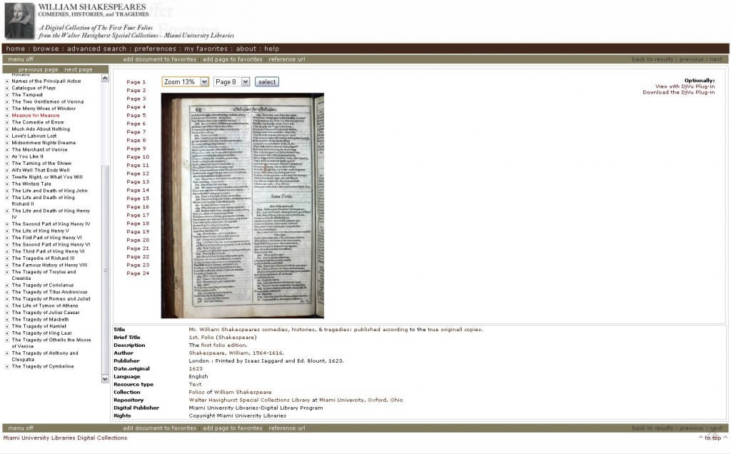
Once you’re at the page you want, you can zoom in pretty deeply (the pull-down menu says “100%”) but it’s actually larger-than-life-size, as you can tell if you click on the image below to see its full size.
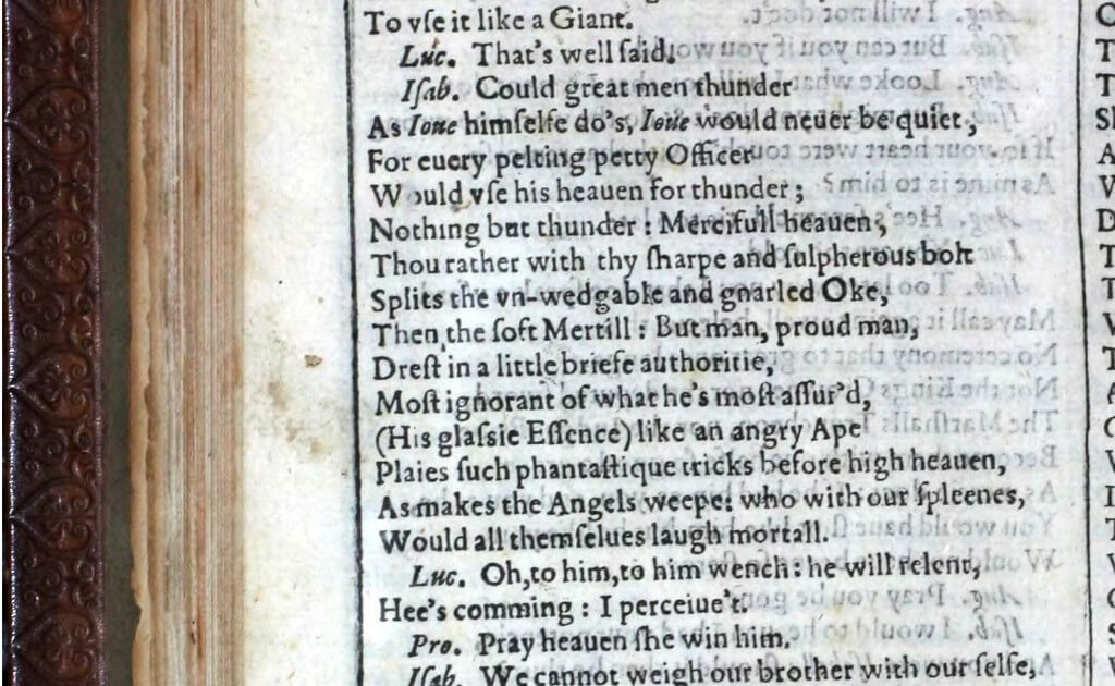
I’m not a big fan of the quality of the image (bleed-through is a lot more distracting in images than it is in real life), but it’s more than usable. What I find really difficult is that once you’ve zoomed into the image, you lose all the navigation tools—the sidebar menus that let you move to different pages completely disappears. Even if you return to a smaller size (the zoom level pull-down is still at the top of the screen), that doesn’t return the sidebars. Perhaps there’s a metaphor in here, about not being able to see the forest for the trees.
A final note, for those of you who actually read all the way through this: I am delighted that all these copies exist and that all these institutions have made them openly available. Where I offer criticisms it’s in the spirit of love and improvement. As I said above, it’s amazing how quickly these projects age: ones built just a decade ago look impossibly old-fashioned and not up to snuff. By looking at how they all stack up, I hope anyone thinking about how to digitize copies of books not only thinks about how they’re being used but how they can be remade so that they continue to be used. ((Also, if you really did read this far, you’re my kind of nerd. Thank you.))
Hi Sarah: Thanks so much for this thoroughgoing comparison of the current facsimile viewers! We appreciate your comments in the Internet Shakespeare Editions facsimile viewer. Happily, we’re in a position to make improvements. We’ll take your wish list as a guide!
Janelle Jenstad (Assistant Coordinating Editor, Internet Shakespeare Editions)
That’s exciting news, Janelle! I love how the ISE allows for comparison across multiple copies of the First Folio and with quartos and the ISE text as well. I wonder, given how many more copies are available out there, if you might be able to pull more F1s into your interface. The Bodleian copy is CC-BY and the Folger copies are CC-NC, so those might be excellent possibilities. I don’t know how easily either makes its data available, but I know who you could talk to at the Folger….
There is also a German digital copy of the First Folio (from the WLB Stuttgart):
http://nbn-resolving.de/urn:nbn:de:bsz:24-digibib-bsz34999692X6
This leads me to another important requirement: URLs for images or at least for the whole book should be persistent.
Thanks for bringing that copy to my attention. And YES! Persistent URLs for both the book and for specific images makes the digitization useful. What’s the point of snazzy images if you can’t direct readers to them?
Thanks for this! The survey, as well as your list of desiderata, is enormously useful and thoughtful.
I don’t think, however, that you are “asking too much.” On the contrary, with regard to digital editions of any sort, much less those that feature digitized page images, I don’t think any of us have been asking nearly enough. The tools available for interface design now — HTML5, CSS3, JQuery, AJAX, XML and XSLT, etc., are pretty powerful: we really should be able to present readers of eTexts with an enormous range of options that make such resources useful for a very broad range of audiences, ranging from high school students right through to textual critics and historians of the book. Instead, the tendency remains, even today, to make such editions single-purpose (and often pretty clunky at that).
Yes, I know that updating old interfaces and designing really versatile new ones is time-consuming and can be expensive . . . But if we really expect online editions to reach their full potential — indeed, if we expect them to catch up in terms of useful to older print facsimiles and editions — we have got to start doing better.
It’s funny/sad how easily it is to fall into the stance of not wanting to ask for too much. But in my bolder moments I would totally agree with you: if we don’t start asking for more, the work that’s been done will fall into disuse. The thing that drives me nuts about some projects is seeing all the work that went into the making of it, only to have the project immediately start sliding into a decline once it’s “done.” Especially with rare materials, shouldn’t we treat the initial creation of digital images as the creation of something that will have a long life not wedded to a single project but something that will continue to generate new outputs? We can’t keep putting rare materials through the intense digitization project every time a new audience arises. And to be really practical about it, wouldn’t it be helpful in procuring funding if ongoing design and development is built into the project from the beginning? I’m thinking of this like conservationists have taught me to think about the work they do: every interaction needs to be reversible. Or, in this case, every development needs to build in extracting the core data and creating a new interface for it.
Sarah: thank you for the interesting and comprehensive comparison. I’d love to know what you think of the new book viewer we recently added to WDL – e.g. http://www.wdl.org/en/item/11290/view/ – as I’ve been trying to support the same workflow you mentioned for browsing through a book and then zooming in to an area of interest without needing to switch back and forth with the PDF. (It also addressed a few largely unrelated goals like scaling down well to a tablet/smartphone display or a slower internet connection)
Obviously this is just the beginning and there are several key features which would be important for most of the work which you described – e.g. we’re looking into ways to reconcile content specific navigation to chapters, key passages, etc. with the range of available data and translation requirements and I’m currently working on integrating full-text search as well. I’d love to hear what else we might be able to do to support your goals – e.g. things like stable URLs for sections of a page image or in-viewer rotation.
I wish someone would make a list of digitized *Second* Folios like @wynkenhimself did for the First: http://t.co/Eiz4KGDSpG
And #ShxBooks students are also critiquing the various digitized facsimiles, a la @wynkenhimself http://t.co/YbejUlY1Wj