So, curious about what the header images are on this blog? All are pictures I’ve taken, and more information on each is below (click to embiggen).
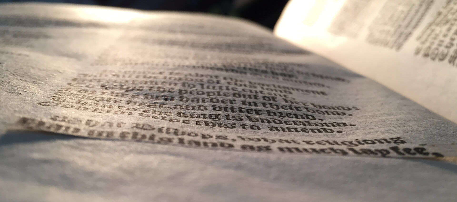
Cancel slips are one of a variety of methods that printers used to correct mistakes (see this long post I wrote for The Collation on the subject). This is from The vvorkes of our ancient and learned English poet, Geffrey Chaucer, newly printed (London: printed by Adam Islip, 1602) in a copy at the Folger Shakespeare Library (STC 5080 copy 3), sig. Q4v.
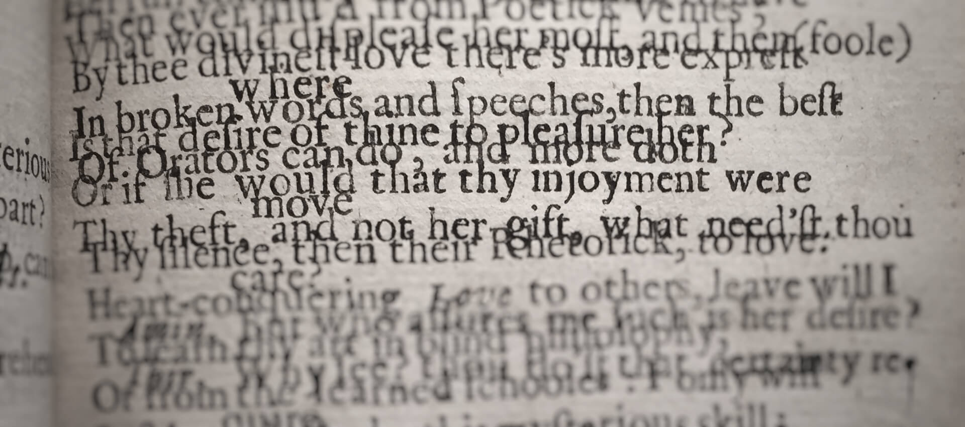
This is another sign of a printing error, but an astonishingly weird and lovely one. It’s a case of accidental overprinting, in which one side of a sheet of paper has its reverse printed on top of it. (I’ve modified it to blur out some of the text, but the impossibly overlapping lines is as in the original.) I love this book, and will write a post about it soon. This is from Aminta: the famous pastoral. Written in Italian by Signor’ Torquato Tasso. And translated into English verse by John Dancer (London: printed for John Starkey, 1660) in a copy at the Folger (T172), sig. D8r (with D7r printed over it).
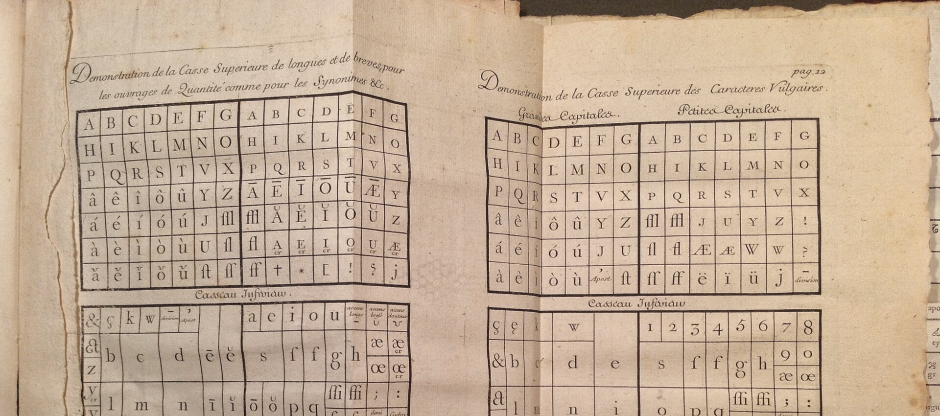
This isn’t a mistake, but it is unfinished: it’s an unfolded plate showing the arrangement of a pair of printer’s cases, illustrating which pieces of type would go in which box in the case. It comes from Martin-Dominique Fertel’s La science pratique de l’imprimerie (Saint Omer: printed by Martin Dominique Fertel, 1723) in a copy at the Folger (267342). I wrote about this copy for The Collation in 2013.
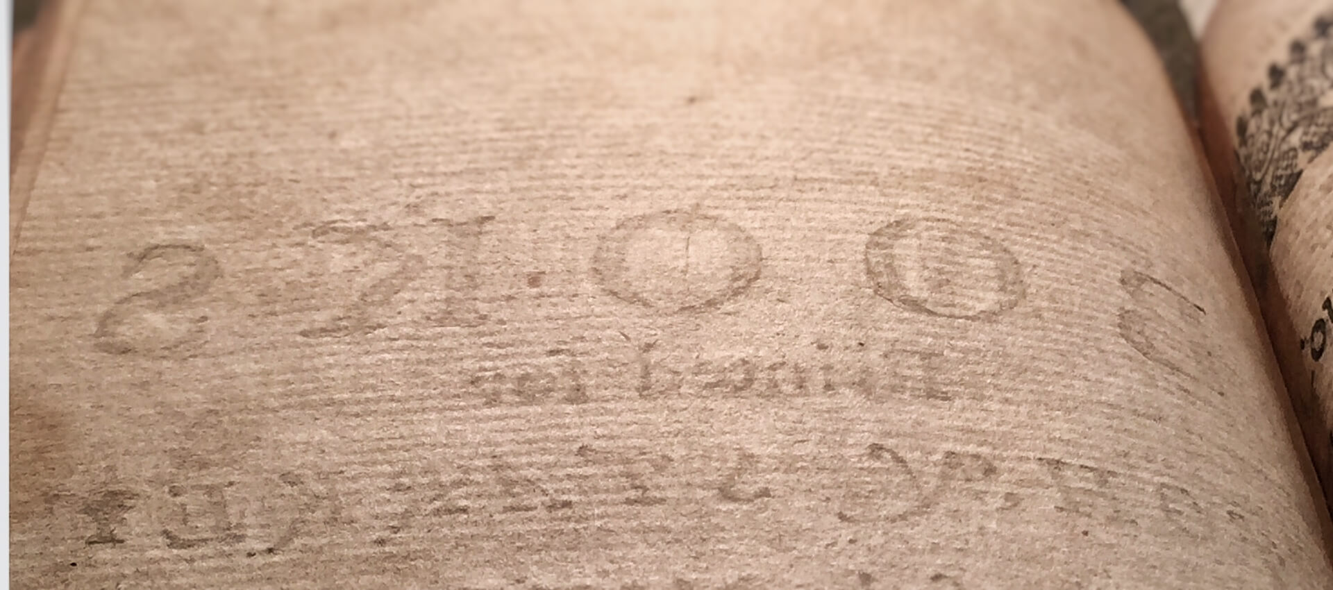
Finally, this an image of something that is perfect, but not necessarily something we pay attention to: it’s the blank verso of a leaf showing the impression of the type that printed “BOOKS,” the beginning of the bookseller John Starkey’s advertisement for his publications. It is, again, from that lovely copy of Dancer’s Aminta (see above) that I teased and still promise to write about.